Combining culture and craft
ANANTA DESIGN STUDIO
South Africa
The designers “We are best friends, in sync in almost everything we believe in,” say sisters Viveka and Rucita Vassen, founders of Cape Town’s Ananta Design Studio. “So, it was inevitable that we would one day build a creative business together.” Launched in 2022, the homeware studio unites the talents of two creatives, neither of whom hails from a product design background. Graduates of Cape Peninsula University of Technology, Viveka studied fashion design, her sister graphic design. Many years in the planning, the studio’s intended focus shifted prior to launching, as the pandemic’s travel prohibitions restricted the Vassens’ initial plans. But the sisters agree this was beneficial to furthering local craftsmanship.
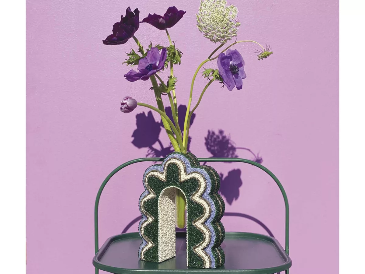
Their work “Inspired by the traditional craft techniques and vibrant colours of Africa, and our ancestral India, as well as a need to create a visual language that represents our identity and crossover of cultures, we embarked on creating the wondrous world of Ananta,” explains Rucita. The enchantment she speaks of takes the form of a sculptural collection of hand-beaded lamps and bud vases. “It was important for us to build a business that economically empowers under-resourced communities and positively contributes to a more conscious world,” adds Viveka. Designed and constructed inhouse, with patterns inspired by themes as disparate as parental love, Indian culture and the 1970s, the homeware is then outsourced to Monkeybiz’s beaders for finishing. In acknowledgment of their contribution, each product includes its beader’s name.
Colour theory “Our Indian heritage has shaped our bold sense of colour,” Rucita explains. “We grew up wearing traditional punjabis and ghagra cholis in the brightest colours when celebrating Hindu festivals.” For the Vassens, colour is synonymous with being Indian and integral to their visual language, a representation of how they regard themselves. “Through colour we have created products that evoke happiness, joy and celebration.”
@studioananta_ (Instagram)
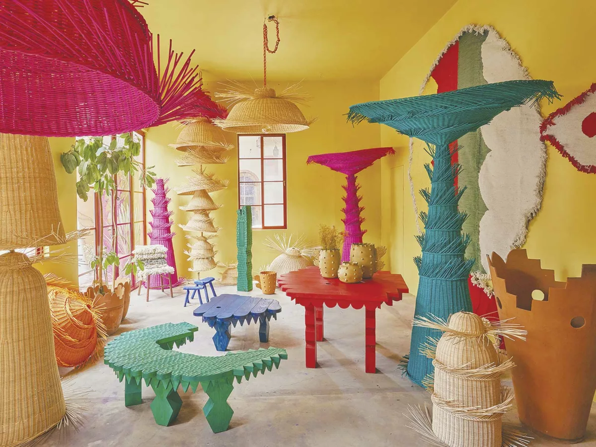
Celebrating Mexican craft
MESTIZ
Mexico
The designer Founded in 2015 by thirtysomething architect and designer Daniel Valero, following his studies in Mexico, France and Finland, design studio Mestiz is based in San Miguel de Allende, in the Mexican state of Guanajuato. In 2021, Mestiz collaborated with American retailer Joanna Williams of Kneeland Co. on a pop-up store in Los Angeles and, being the rising star that he is, graced the cover of Mexican Architectural Digest in the same year.
His work “We create wild objects and textiles inspired by the natural surroundings and cultural syncretism of Mexico’s artisanal techniques,” Valero explains of his studio’s philosophy. Step into his workspace, filled with textiles, ceramics, furniture, wickerwork, drawings and rugs, and his celebration of Mexico’s cultural heritage is unmistakably apparent. “The objects in my studio have been produced in four regions of my country, with ethical awareness and a commitment to artisans, their techniques and knowledge,” he says of wickerwork made in Querétaro, textiles made in Coahuila, and ceramics and woodwork handcrafted in his own Guanajuato.
Colour theory Known for his wicker lampshades in bougainvillea pink (“The pink to end all pinks,” as Williams describes it), Valero’s studio is an explosion of colour with ties back to centuries’ worth of Mexican craft and design. Against a backdrop of mustard walls, rich blue ceramics sit on red tables and forest green totems reach for the ceiling. Mestiz’s newest collection – Wood Fauna, a series of zoomorphic wooden furniture pieces with scaly and jagged edges and produced in collaboration with local craftsman Don Javier – looks as if it may bite if approached too quickly. Each painted in a monotone colour, Wood Fauna’s pieces are primary coloured and thus universally inviting, their carved wild shapes crafted using techniques with roots in the 17th century and, as Valero describes it, “inspired by the figures and symbols of Novohispanic baroque.”
www.mestiz.mx
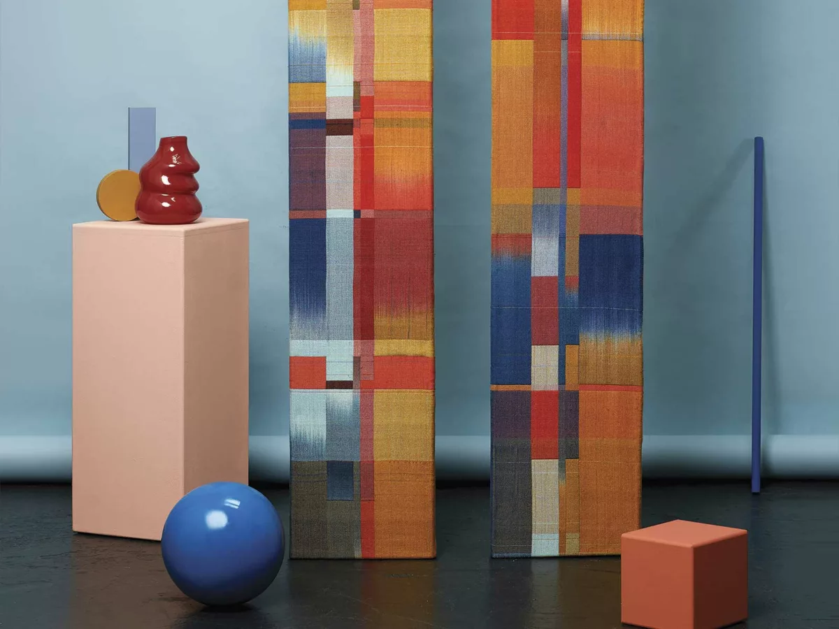
Looming over history
DALIA JAMES
England
The designer “I’m from a creative family, so I love using my hands,” says Loughborough University’s Textile Design graduate Dalia James from her Walthamstow studio. For the weaver, this applies as much to her preparatory sketches as it does to her woven designs. She eschews planning designs in Photoshop, instead favouring watercolour drawings that allow her to carefully consider colour.
Her work James weaves tonal wall pieces using silk, bamboo and seacell (a seaweed and lyocell hybrid) yarns. While her compositions are abstract, they take as their starting point the physical world, specifically her interest in Bauhaus design and colour theory, as well as architecture. “My first large scale artwork, Intersection, was influenced by Tuscan religious architecture,” she explains. “Florence’s basilica is covered in a striking geometric pattern of green, white and pink marble, and this felt like the perfect starting point for a project.” She’s equally inspired by William Morris’s commitment to elevating the status of craft and his interest in the natural. “The sheer variety of colour that he was able to achieve using only natural dyes fascinates me. He was committed to preserving the environment and saw the damage industrialisation, including the development of synthetic dyes, could pose to the natural world.”
Colour theory James’s research into, and use of, natural dyes is an ongoing project. “Despite using limited quantities of yarn and dye, I’m aware that the fashion and textile industry is one of the worst polluters in the world, so I like to do my bit.” For over a decade she has dyed her own yarns, experimenting with tonally-rich natural materials including cochineal and turmeric. “I’m interested in how people perceive the areas where two colours meet, as well as how they perceive those hues in relation to surrounding colours,” she says of her compelling compositions.
www.daliajames.com
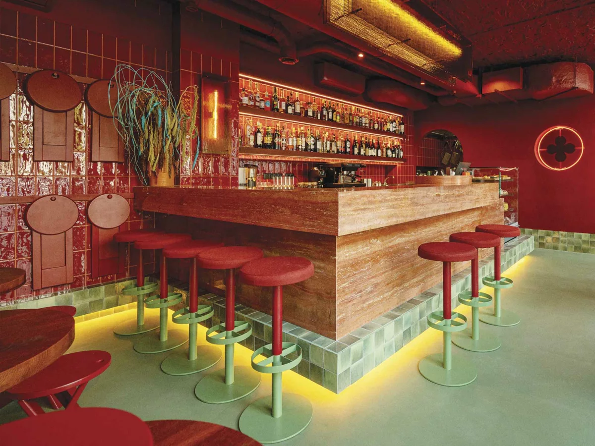
Reinventing Italy
NOKE ARCHITECTS
Poland
The designers Founders Piotr Maciaszek and Karol Pasternak of multidisciplinary design studio Noke Architects pride themselves on working across several disciplines. They worked closely with the studio’s interior designer Aleksandra Hyz and lauded illustrator Ola Niepsuj on Va Bene Cicchetti, a small plates bar in Warsaw.
The project Commissioned by its owners to create an environment for Va Bene Cicchetti that was distinctly Italian, Maciaszek opted to reference the city of Venice, albeit in a subtle manner. “Venice is easily imagined based on a single postcard, but to live it is something completely unique,” he explains. “Our challenge was to bring this experience to patrons.” Here was an opportunity to dispense with the ubiquitous tropes of red-checked tablecloths popularised by a diaspora of trattorias. “We wanted the place to be unambiguously associated with Venice, but we also wanted for this reference to be fresh,” he continues.
Colour theory Va Bene Cicchetti’s interior and branding draw inspiration from the colours of the Venetian flag, red and gold. Warm hues dominate, with the bar counter, furniture, walls and ceiling in a deep red – which adds intimacy to the compact space – and gold used sparingly as an accent colour. The bar’s element of surprise, though, is delivered through Maciaszek’s unexpected use of green, which references periods of flooding (known as acqua alta) in Venice when the Adriatic Sea’s tide rises, with floodwaters covering the piazzas and streets. To recreate this flooded look Maciaszek explains, “Flood water appears in the form of sea green floors and skirtings, and everything up to about 25 centimetres in height – table legs, chairs and display cases – are coloured in the same marine hue.” Va Bene Cicchetti’s entire basement level, too, is coloured in this aquamarine tone, suggesting it is underwater.
www.nokearchitects.com
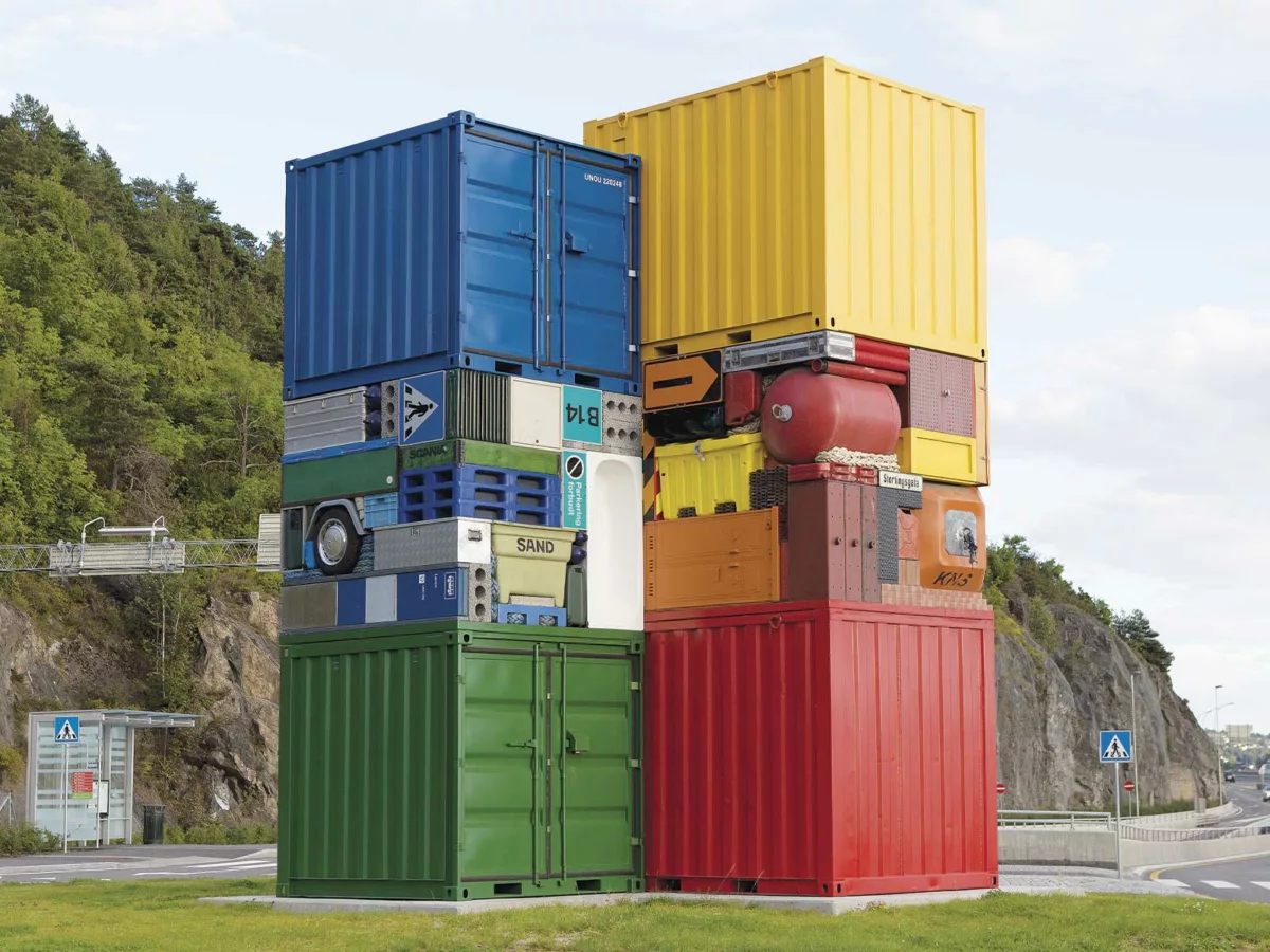
Archeological Rubik’s Cubes
MICHAEL JOHANSSON
Sweden
The artist “I describe my process as playing real-life Tetris,” says Swedish-born sculptor Michael Johansson of his archaeological-like sculptures and installations that force viewers to reconsider everyday objects. A graduate of Malmö Art Academy (with a master’s in fine art), Johansson lives and works in Berlin. He has exhibited globally, in cities including Reykjavik, Tokyo, Mexico City and Milan, often creating site-specific public installations from materials sourced at and around his exhibition spaces.
His artworks “I usually collect things at second-hand stores and at flea markets, because I like to use items that have lived a life before I find them, objects that have traces of the people who previously owned them,” Johansson explains. “I use these items as building blocks to create different stories or small condensed worlds.” Johansson’s worlds are predominantly rectilinear, taking the form – within the confines of galleries – of cubes, shelves and (more recently) ladders and, outdoors, either as larger installations (objects sandwiched between shipping containers, for example) or as interventions that snuggly fit within architectural gaps. Look closely at his mostly monochromatic artworks and you’ll notice plastic crates, mechanical devices and electrical appliances, storage containers, portable money boxes, plastic ice blocks and other household items. Meticulously arranged, with each item a perfect fit for its space, you may ask what these sculptures mean. “You could say my works are based on society’s overproduction of things,” he offers by way of explanation.
Colour theory Repetition is an important component in Johansson’s work, both by way of objects and equally by way of colour. By creating artworks either monochromatic or limited in tone, Johansson brings cohesion to disparate objects, resulting in unexpected beauty. His use of colour equally offers insights into how we live; the many items he collects are modern-day artifacts, cultural indicators about the communities from which they come.
www.michaeljohansson.com
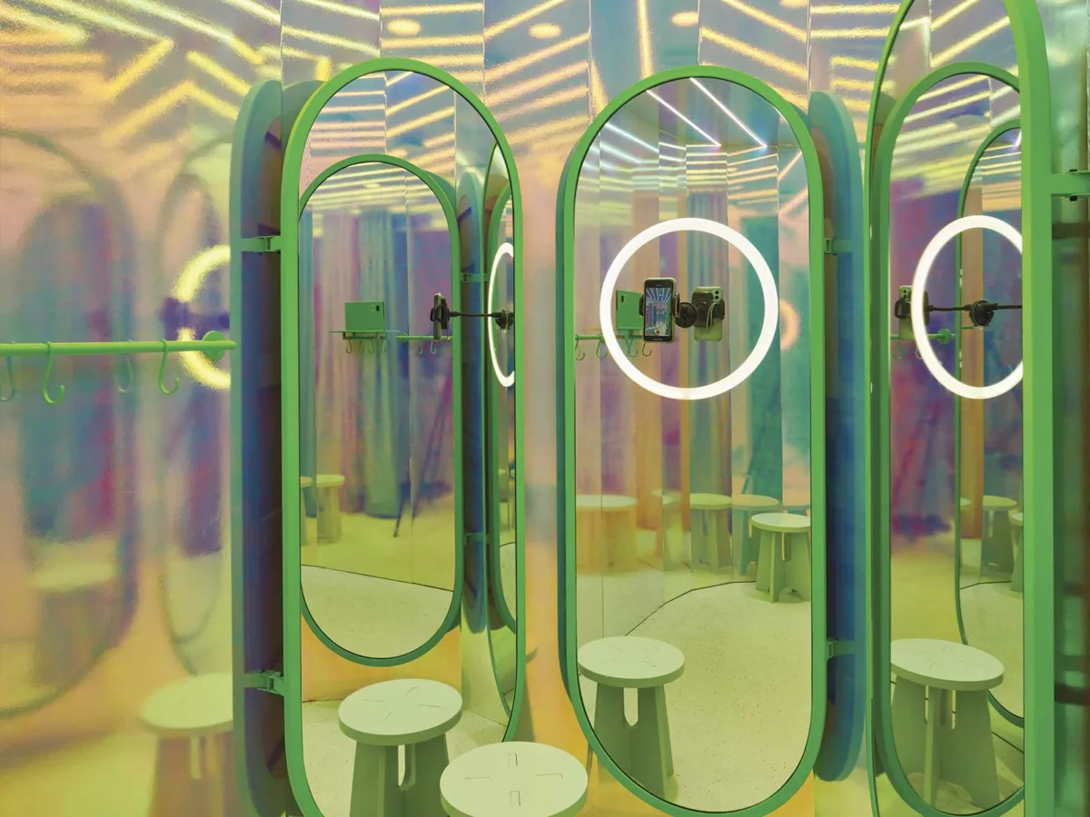
Pastels for a metaverse
MASQUESPACIO
Spain
The designers Branding and interior design consultancy Masquespacio was founded by Ana Hernández and Christophe Penasse in 2010. Over the past thirteen years they’ve worked on projects in countries including France, USA, Cambodia, Germany and Qatar, and are the recipients of multiple awards, from the likes of Elle Deco International, Wallpaper, and The New York Times.
The project Masquespacio was commissioned by fashion retailer Mango to conceptualise the interiors of Barcelona’s flagship Mango Teen, a brand division catering to teenagers. The results are a newly-opened store that’s a visual response to teen consumer data provided by Mango. Hernández reflects on how colour and a craving for the experiential and interactive topped teen expectations. “The best thing about being a teen is that you’re living in a world full of dreams and discovery. It’s an age when you start to dream big, without factoring limitations,” she says. “The store’s entrance tunnel takes shoppers back to the surrealism of dreams, and to a future in which conventional elements from our past are being considered futuristic for new generations.” A washing machine, intended as a receptacle in which to leave old clothes for recycling, and which releases bubbles when opened, is one such conventional element.
Colour theory Colour is also approached with a sense of the surreal in mind. “We initially chose a pinkish palette, but as this is getting a bit outdated, we decided to play with two colours that are less explored instead,” explains Penasse. Pastel orange and green coexist with their neon counterparts, with hard distinctions between the two defining retail subspaces. Reflective surfaces, like the fitting room walls, mark a secondary approach to colour. They’re considered by Masquespacio to be a connection to a futuristic digital world, a metaverse. Their optical effect not only distorts colour and reality, but creates an unusual backdrop for selfies.
www.masquespacio.com
by Martin Jacobs