From South Africa’s centuries-old Ndebele dwellings and the façades of Mexican architect Luis Barragán’s buildings to the multi-hued balconies of Le Corbusier’s ideologically-rooted Marseille Unité d’Habitation apartments and the over-the-top interiors of Verner Panton’s Der Spiegel publishing house, colour in architecture and interior design has long been a tool for storytelling. While today’s interiors often steal the spotlight when it comes to colour, a shift is happening in the architectural world. Recent years have seen architects creatively embracing colour and transforming structures into candy for the appreciative eye.
Take Japanese architect Shigeru Ban’s Simose Art Museum in Otake, Hiroshima, which was crowned The World’s Most Beautiful Museum by UNESCO and Prix Versailles last year. The accolade (awarded by a jury including renowned architects David Adjaye and Daniel Libeskind) suggests a craving for vibrancy in an era shadowed by uncertainty and fear, and in which architecture’s embrace of colour appeals to our sense of hope and resilience.
Ban, recipient of the 2014 Pritzker Architecture Prize, and who has offices in Tokyo, New York and Paris, has created eight 10m2 movable exhibition rooms at Simose, each enclosed in coloured glass. Inspired by the offshore islands of the Seto Inland Sea, they float on a water basin, creating a landscape of their own. The structures sit atop submerged barges, allowing each cube to be moved by two people, so that the exhibition rooms can be reconfigured (adjacent to one another or linked by bridges) to enhance an exhibition’s narrative. Most striking after dark, the cubes are illuminated from within, imbuing their pastel colours with subtle ombre gradations.
Similar pastel shades are used for material homogeneity at Educan on the outskirts of Madrid. Designed by Spanish architects Lys Villalba and Enrique Espinosa, founder of Eeestudio, the building is described by its owners as a ‘school for dogs, humans and other species’. A centre for dog trainers and training, the building was also designed to house birds of prey as well as small birds and bats (both feeding on insects that carry canine diseases). Arranged over a single storey, with high ceilings creating perches for birdlife, Educan was constructed from extra-large shipping containers. Additional materials include steel beams, corrugated metal, foam insulation and exposed service ducts, and it is these industrial materials that Villalba and Espinosa wished to unite. Mint green homogenises the upper half of the structure both indoors and out. The result is a visual harmony of surfaces that include patterned pyramidal insulation and the undulations of corrugated sheeting.


Below, a bolder blue is used to frame apertures and openings, with yellow demarcating space dividers and pops of orange softening the industrial atmosphere.
Bold hues and pastel shades combine for effect in the work of German multidisciplinary designer Alex Proba too. Founder of Brooklyn- and Portland-based Studio Proba, she studied Spatial Design at Akademie Mode & Design Hamburg, followed by Contextual Design at Design Academy Eindhoven, before moving to New York in 2011. Proba’s celebration of colour is intended to stimulate the senses. Clients including Nike, Google, Louis Vuitton and Samsung tellingly reveal a desire on the part of global megabrands to inject colourful energy into their identities.
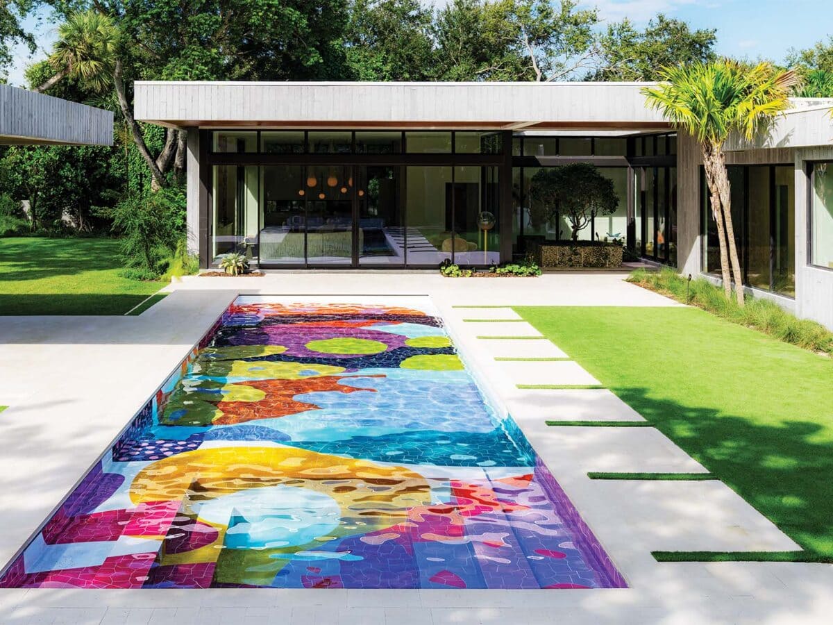
No stranger to conceptualising and painting murals, including those on the bottom of swimming pools (like projects Hill House and Marrow House), Proba’s most recent residential project – which took close to a year to complete – marks a shift in her practice. Rather than working with paint, Proba handcrafted a bespoke swimming pool for Fernandez Pool comprising over 8 000 organic ceramic tiles made in partnership with Mexico’s Ceramica Suro. The curvilinear forms of her design were inspired by coral reefs, with white grouting echoing the caustic patterns cast on the pool’s bottom by light refracted through water. Proba combines her signature use of lavender, peach and rust with strong warm tones, an informed use of complementary colours that makes for a design that’s energising and enthralling.
While on the subject of pools, in Lisbon – a city with a high count of sunny days per annum – the effect of temperature and time (in other words, light) on colour was the conceptual starting point for interior designers Nuno Gusmão (of Atelier P06) and Barbara Neto (of Lemon Variance) when designing Lumen Hotel. The rooftop pool is tiled in a rich and varied orange mosaic.
‘The pool plays with sunlight, its penetration intensifying and reddening the colour of the tiles,’ says Gusmão. If the bold red hues of the pool represent sunlight at its most intense, dawn and dusk were the inspiration for the hotel’s rooms. ‘When booking a room, guests can choose between Golden Dawn, its yellows reflecting the vibrant tones of sunrise, or Copper Nightfall, with oranges and reds reminiscent of the warm colours of sunset,’ explains Neto. Nuances in the colouring of the leather headboards, tinted mirrors, ombre artworks and upholstery differentiate the two room types, with the sunlight coming from floor-to-ceiling windows intensifying the effect.

In another hotel, in New York’s Soho district, glamour and gloss make for a jewel box of interiors. Milan-based multidisciplinary designer and architect Hannes Peer partnered with Verena Haller, Global Head of Design & Creative Services at Hyatt, on the design of the recently-opened The Manner. Looking around the lobby and The Apartment (a guests-only lounge), the influence is undeniably Brutalist, with ceramic wall art by Giovanni De Francesco, totems by Nicholas Shurey, and glass-and-steel chandeliers by Peer himself. His use of colour in these communal spaces tends to the darker and dirtier, with tans and teals offset by mahogany tones and marbled and burl surfaces. The effect is sophisticated ’70s, a look that’s really embraced in The Manner’s suites and penthouse.
The duplex penthouse is a study in red, drawing inspiration, as Peer words it, ‘from Halston’s modernist, monochromatic offices in the Olympic Tower’. Deep crimson tones come into their own in plush carpeting, velvet upholstery and lacquered surfaces. Paired with gold accents, they combine to evoke a bygone era of the city’s hedonistic social scene. These same gold accents take on even greater significance in the rooms and suites on the floors below. As Vogue USA describes them, ‘Every wall is either mirrored or painted in an eye-popping shade of shiny, egg-yolk yellow, accented with glossy mahogany, hot red cabinets, and slivers of gold. Think Gio Ponti on acid, with a dash of classic New York, Studio 54-worthy glitz.’ Add to this sofas, armchairs, doors and hallways in jewel tones like emerald green and midnight blue, and shine everywhere, and Peer’s mastery at evoking a vintage era through colour is entirely apparent.
Mayela Ruiz, founder of Mexico’s Maye Estudio, embraces a similar use of jewel tones – here paired with pastels – for the interior design of Casa Coa, a residence sited on one of San Miguel de Allende’s most iconic streets. Inspired by snake motifs that adorned the original structure, Ruiz’s furnishings and hardware for the home repeatedly favour curvilinear forms, like serpentine doorhandles and the scalloped edges of wicker lampshades crafted by Mestiz. Ruiz’s use of colour takes on an unquestionable sophistication in Casa Coa’s living room, in which the muddied green walls and ceiling are complemented by burgundies, reds and pinks, all offset by two ochre-hued armchairs.


Considered by many to be clashing colours, pink and red sit adjacent to one another on the colour wheel so, in fact, complement each other. Ruiz’s use of shades of these colours exclusively in the master bedroom reflects the vibrancy of the palette and how utterly modern it can feel, while referencing the intensity of colours we’ve come to expect from Mexican design.
By comparison, when conceptualising the newly redesigned Morukuru River House in South Africa’s Madikwe Game Reserve, interior designer and founder of Hinterland Studio Amy Kidger avoided the stereotypical colour palettes – often browns and beiges – associated with African safari style.
While the dark tones of thatch ceilings and varnished door frames were unavoidable, Kidger’s decorating palette colourfully draws from the surrounding terrain in a manner that feels refreshing.
Upholstery and fabrics in rust and burnt orange tones unmistakeably reference the colour of the earth visible on game drives, with murky green accents – noticeable in scatter cushions and woven pendant lamps by Ashanti – chosen for their close match to the many leadwood and shepherd’s trees in the area. These complementary colours intensify each other, their impure tones harmonising to full effect in the living room. It’s here that a Boogie Nights coffee table by Egg Design encapsulates so many of the natural hues Kidger has incorporated into her scheme. With its verdigris copper top and handmade ceramic tiles (in a green that’s similar in tone to the leaves of the tamboti trees surrounding the house), the table’s patinated surfaces speak to an African aesthetic without turning to clichés.
Whether it be colours drawn from a landscape so as to harmonise with it, or, like Ban’s exhibition cubes, those intentionally chosen to contrast with their surroundings, architects and designers are reembracing colour as a means of storytelling. These tales may be cultural reflections or stories of heydays of style. Whether they’re told in primary hues or in murkier tones, in soft pastels or complementary colours, they contribute dynamism and vibrancy to a world in need of rose-tinted glasses.